cannvisa
A bold cannabis brand identity shaped through vibrant color, strong typography, and an abstract leaf-inspired symbol.
Client:
PTS / cannvisa
Category:
Brand Identity, Visual Design, Brand Applications, Packaging Design
My Role:
Senior Graphic Designer · Brand Identity · Visual Direction
cannvisa is a brand identity and visual communication project created for a cannabis-related platform. The identity uses bold typography, a vibrant green palette, and an abstract asterisk symbol inspired by the cannabis leaf to create a modern, recognizable, and flexible brand presence.
The project focused on building a visual language that could connect with the cannabis category without relying on overly literal clichés, while remaining adaptable across digital, print, packaging, merchandise, and campaign applications.

Overview
cannvisa is a brand identity and visual communication project developed for a platform in the cannabis sector. The goal was to create a bold, modern, and recognizable identity that could work across digital, print, packaging, campaign, and brand applications.
Instead of relying on literal cannabis imagery, the identity uses typography, contrast, vibrant color, and an abstract symbol to create a more flexible and ownable visual language.
The Challenge
The main challenge was to connect clearly with the cannabis category while avoiding common visual clichés, such as literal leaf symbols, earthy palettes, or overly casual branding.
The identity needed to feel confident, contemporary, and adaptable — strong enough to stand out, but simple enough to work consistently across different touchpoints.
My Role
As the designer, I worked on the visual direction, logo concept, color palette, graphic symbol, brand applications, and overall identity presentation.
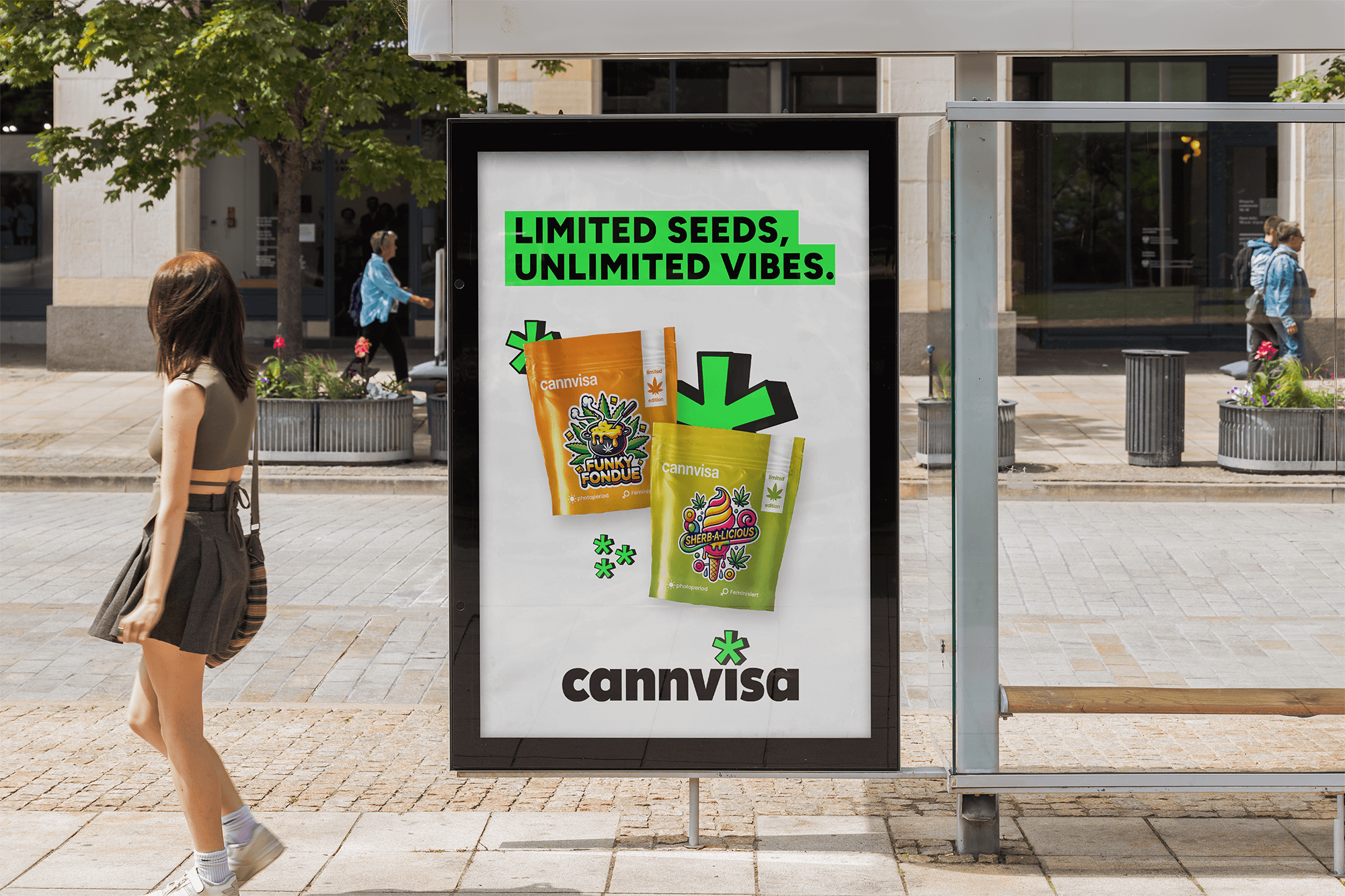
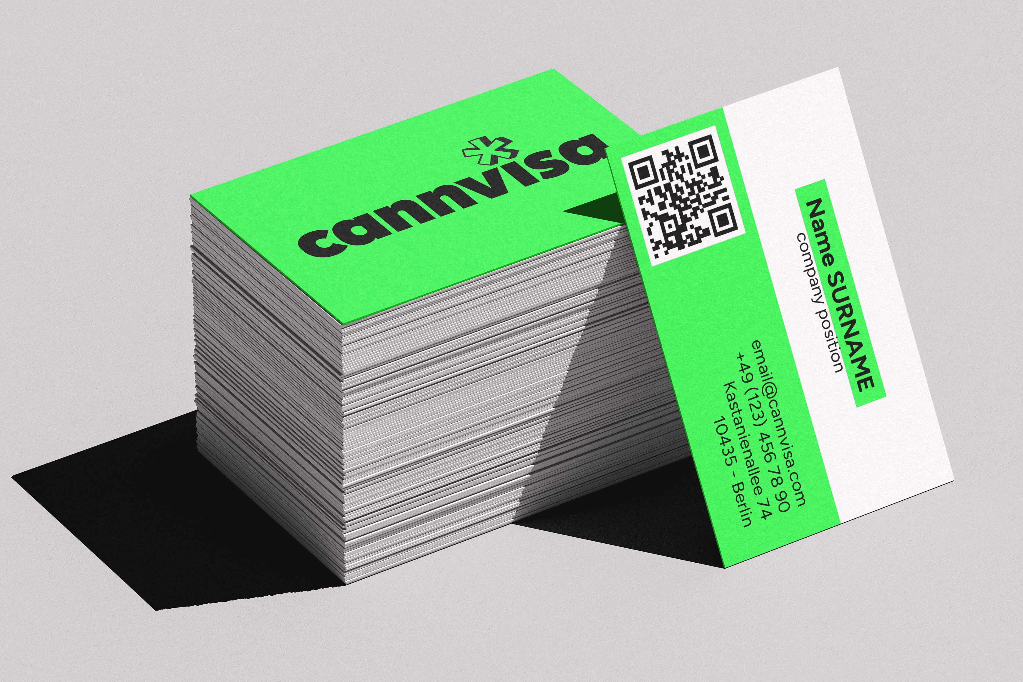
I also created mockups to test how the identity would behave in real-world contexts, including website layouts, business cards, posters, packaging, merchandise, and secondary logo variations.
Design Direction
The visual direction was built around boldness, contrast, and memorability.
A bold typeface was chosen to give the brand a modern and confident presence. The vibrant green creates an immediate connection to cannabis, while feeling more energetic and contemporary than traditional natural tones.
The asterisk became the central symbol of the identity. Rather than using a literal cannabis leaf, it translates the leaf’s radial geometry into a more abstract, distinctive, and flexible brand element.
Applications
The identity was applied across digital, print, packaging, merchandise, and promotional touchpoints. The combination of bold typography, vibrant green and black-and-white contrast, and the flexible asterisk symbol created a consistent visual thread across all materials.
Outcome
The final identity gives cannvisa a bold and memorable brand presence. It connects with the cannabis category through color and symbol, while avoiding generic cannabis imagery.
The result is a simple, flexible, and visually strong identity that can scale across multiple touchpoints while maintaining consistency, recognition, and personality.